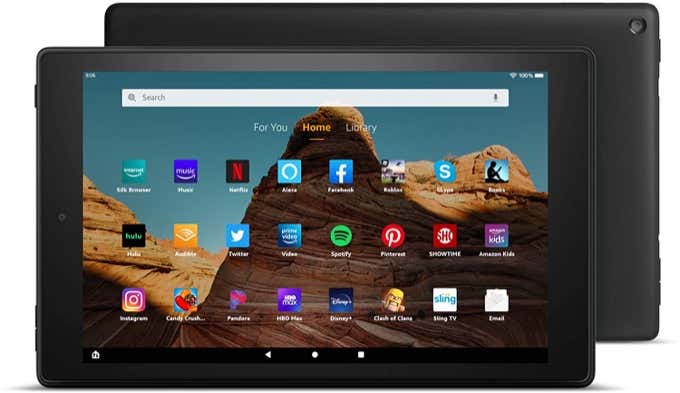
The specs are also fairly impressive. It has a 10.1 inch, 224ppi LCD display. It features a 2GHz Mediatek MT8183 octa-core processor with 2GB of RAM. You can get models with either 32GB or 64GB internal storage. It also supports a microSD card for extra storage of up to 512 GB.
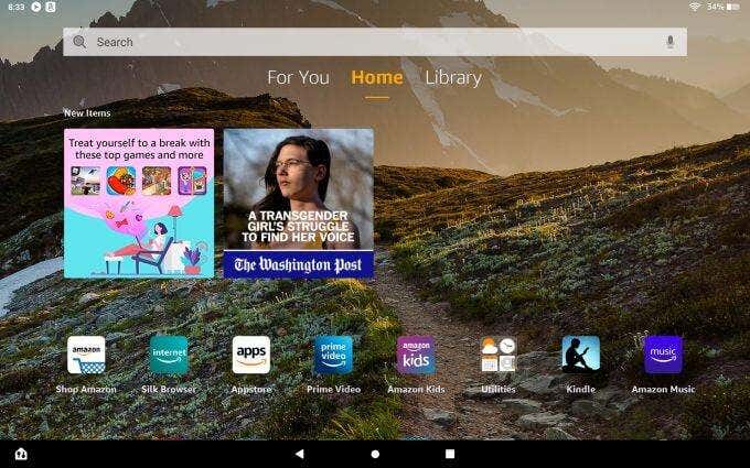
1. Annoying Login Ads
To unlock, you need to drag a finger from the lock icon up.
3. The Silk Browser
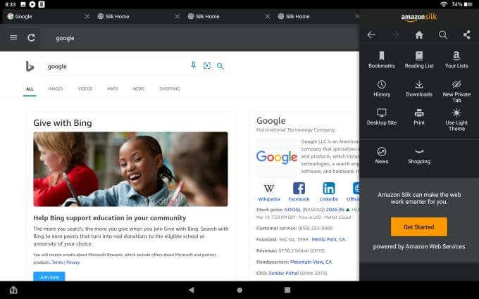
We’ll get to that limitation in a moment, but first it’s important to review the limited features of the Silk browser itself. As a basic browser, it does the job. It defaults to use the Bing search engine (although you can change this). It is a minimalist, fast browser that gets the job done and will let you surf the internet as well as just about any other browser out there. However, there’s no real room for expansion with extensions or add-ons. Beyond the basic browser features, don’t expect bells and whistles at all. The menu is where you’ll find most features, which includes bookmarks, switching dark and light themes, forcing desktop viewing of sites, and a “Private Tab” feature like Chrome’s incognito. If you want to use some other browser like Firefox or Chrome, you’re out of luck. If you try searching the Appstore for these browsers, you won’t find them. What you will find is an unusual app called Google Search, which you may think is the equivalent of the Chrome browser. It isn’t.
4. Google Services Are Scaled-Down Alternatives
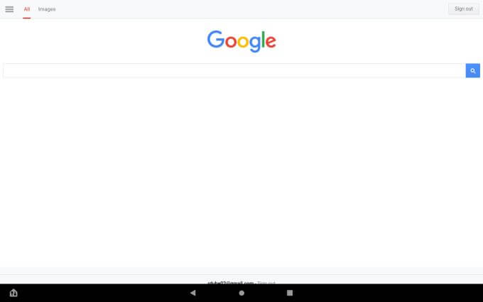
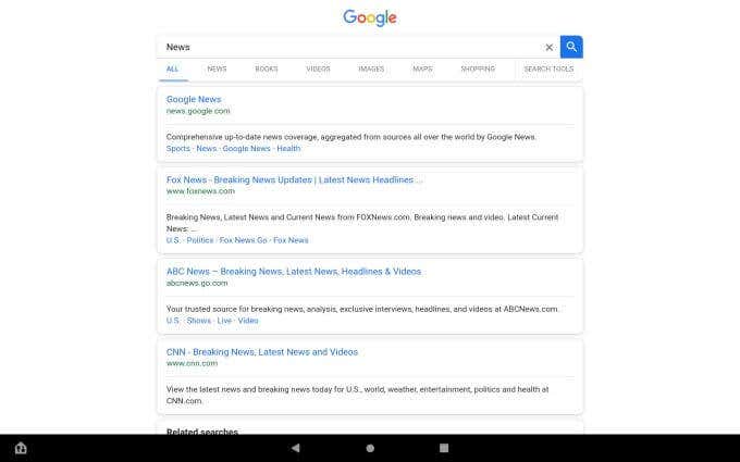
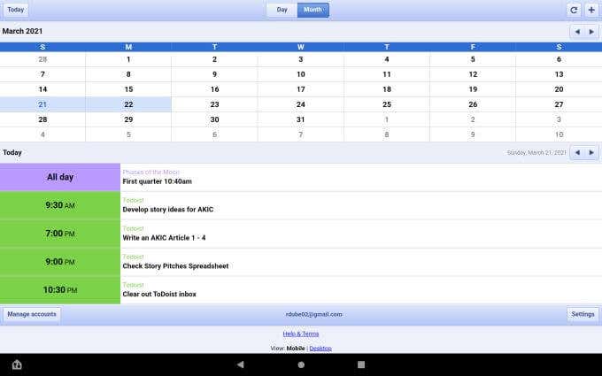
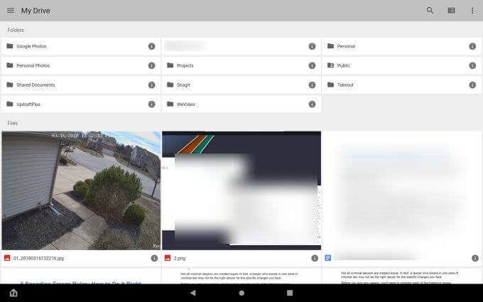
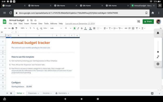
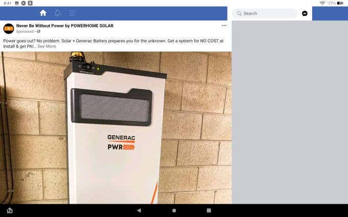
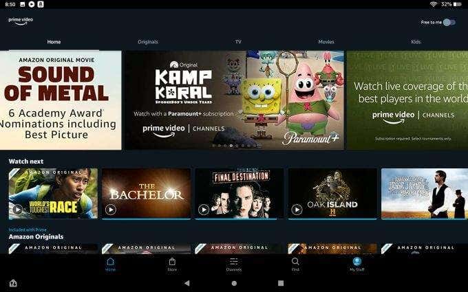
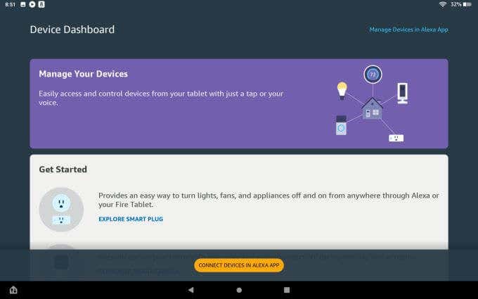
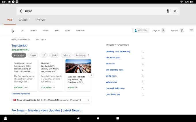
Google Search is an app that lets you use the Google search engine. Google Chrome this is not. It’s sort of like a beyond-minimalist app that lets you search Google Web and Google Images. The menu itself is very basic and offers no real links to many other Google services or your Google account. Search listings default to mobile view, so they don’t even fill the entire page like you would expect. It does the job, but not very well. Especially if you’re used to all of the features offered by the Chrome browser. Other apps that seem to offer Google services you might want to use are equally scaled down. For example, Google Calendar is absolutely nothing like Google Calendar on the web, or even the Google Calendar app offered by Google for mobile devices. You only get a Day and Month view, no weekly view at all. There are really no other features to speak of, and the Settings menu is bare of any useful tweaks or customizations to speak of. Yes, if you sign into your Google account on the app, you can access all of the folders and files in your Google Drive. However, that’s all you can do. It’s essentially a way to access your files so you can view them, edit them, or download them. That’s it. This is a major drawback. Even worse, viewing or editing files doesn’t even use the Google Drive app itself. It opens the file in the Silk browser, where you can view and edit. Essentially, the Google drive app is almost entirely useless. You’d be better off just accessing your Google Drive account using the Silk browser instead. It isn’t just Google services or apps that are severely limited in functionality. One example is the Facebook app. If you tap the menu, it lacks almost everything you see in the Facebook menu on the web or mobile version as well. And again, anything you tap like a link or image will always open in the Silk browser. Like Google services, you’re better off just using the Silk browser to access the Facebook site to begin with. You can search for and watch content, view Channels, or select My Stuff to access your library and more. For example, the tablet has a dedicated “Device Dashboard” to access and control your smart home devices. But the entire feature is dedicated entirely to using Alexa to control those devices. Don’t expect the same kind of easy integration if your smart home control hub is something like Google Home. The search field at the top of the main screen on the tablet is convenient, but a bit weird. If you search for anything there, it opens something that looks like a very basic web browser – with internet search results displayed in the center window. These results are powered by Bing.
7. Tablet Utility Apps are Not Very Useful
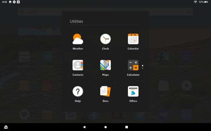
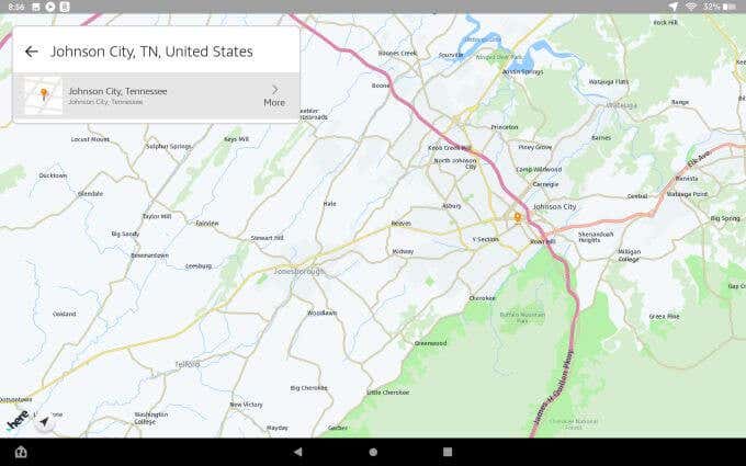
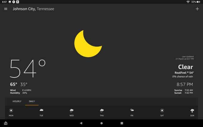
If you tap the Utilities icon, you’ll see a list of apps like a calendar, clock, weather, maps, and more. These are all such bare-bones apps that they’re essentially useless. The Maps app does let you search for locations and build an itinerary, but it lacks even a quarter of the features you’d find on a mapping app like Google Maps. The Calendar, Clock, and Calculator utilities are even less functional then similar apps that come standard on your smartphone. The only somewhat useful utility is the Weather app. This senses your location (or lets you search for others), and shows everything you’d need to know like current weather, high/low temps, precipitation, sunrise and sunset, and a forecast at the bottom.
